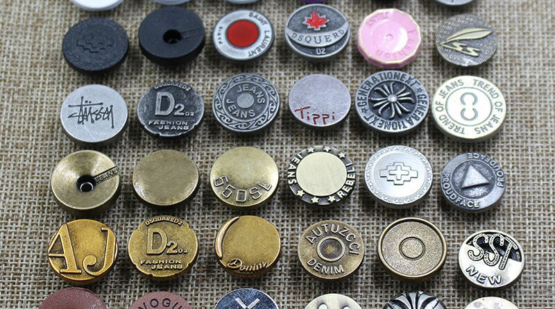
Unlock the Power of Button Design
Unlock the Power of Button Design
Buttons are ubiquitous in our digital world. From websites to mobile apps, buttons play a vital role in user interface design and interaction. They serve as a call to action, guiding users to perform specific tasks and navigate through various interfaces. However, the significance of button design extends far beyond its functional aspect. A well-designed button has the power to enhance usability, improve user experience, and even influence user behavior. In this article, we will explore the importance of button design and delve into key principles and best practices to unlock their true potential.
Importance of Button Design:
Buttons are essential elements of user interfaces, providing users with a clear and actionable path to interact with digital systems. They serve as signposts, guiding users through a series of actions and facilitating seamless navigation. A well-designed button can:
- Enhance Usability: Buttons should be easily discoverable and distinguishable from other elements on the screen. Proper sizing, placement, and visual cues make buttons more accessible, improving usability for users of all levels of familiarity with the interface.
- Improve Visual Hierarchy: Buttons are often used to highlight primary and secondary actions, helping users understand the relative importance of different functions within an interface. Proper design can guide users’ attention and ensure they can easily identify and prioritize the most important actions.
- Encourage Interaction: Buttons with clear and compelling call-to-action text can motivate users to take desired actions. Engaging and persuasive button design can increase user engagement and drive conversions, whether it’s making a purchase, subscribing to a service, or submitting a form.
- Reflect Brand Identity: Buttons offer an opportunity to reinforce a brand’s visual identity and create a cohesive user experience. By incorporating brand colors, typography, and other visual elements, buttons can help establish a consistent brand presence across various touchpoints.
Key Principles of Button Design:
- Clarity: Buttons should have clear and concise labels that accurately describe the action they perform. Avoid using vague or ambiguous wording that might confuse users. Use familiar and intuitive icons sparingly, as they may not be universally understood.
- Visibility: Buttons should stand out from other elements on the screen. Employ contrasting colors, distinct shapes, or visual effects such as shadows or gradients to make buttons more noticeable. Ensure that the button design adheres to the overall visual hierarchy of the interface.
- Size and Target Area: Buttons should have an adequate size and touch target area, especially in mobile interfaces. Users should be able to easily tap the button without accidentally activating adjacent elements. The recommended minimum touch target size is around 44×44 pixels.
- Consistency: Maintain a consistent button design across an interface or application. Consistency in button shape, size, placement, and visual style helps users develop mental models and reduces cognitive load. Familiarity improves usability and makes the interface more intuitive.
- Feedback and Responsiveness: Provide visual feedback when a button is pressed or clicked to acknowledge user input. This can be done through animations, color changes, or subtle visual cues. Prompt responsiveness assures users that their action has been recognized, enhancing the overall user experience.
Best Practices for Button Design:
- Use Negative Space: Surround buttons with ample negative space to give them breathing room. This helps users focus on the button and reduces the chances of accidental taps or clicks.
- Use Color Strategically: Color plays a crucial role in button design. Choose colors that align with your brand identity, while also considering accessibility guidelines. Ensure that color contrast between the button and background meets accessibility standards to accommodate users with visual impairments.
- Provide Affordances: Design buttons in a way that suggests their interactive nature. Employ visual cues such as gradients, shadows, or 3D effects to give buttons a tactile appearance, making them look clickable and touchable.
- Mobile-Friendly Design: With the prevalence of mobile devices, it’s crucial to optimize button design for smaller screens and touch interactions. Ensure buttons are large enough for easy tapping, and consider the placement and spacing to avoid accidental touches.
- Test and Iterate: Conduct user testing and gather feedback on button design to identify any usability issues or areas for improvement. A/B testing can help determine the most effective button design in terms of user engagement and conversions.
- Consider Contextual Design: Buttons should adapt to the context in which they appear. For example, a primary call-to-action button on a landing page might have a more prominent design than a secondary action button on a form. Tailor the visual style and prominence of buttons based on their relative importance and the user’s current task.
- Microinteractions: Add subtle animations or microinteractions to buttons to provide delightful user experiences. This could include hover effects, loading spinners, or completion animations that visually communicate progress or success.
- Accessibility: Ensure that button design meets accessibility standards. Use high-contrast colors, provide alternative text for icons, and consider incorporating additional accessibility features such as keyboard navigation or support for screen readers.
Conclusion:
Button design is a critical component of user interface design, impacting usability, user experience, and overall engagement. By adhering to key principles and best practices, designers can unlock the true power of buttons, creating intuitive interfaces that guide users and encourage desired actions. Remember, the success of button design lies in its clarity, visibility, consistency, and responsiveness. By harnessing the potential of button design, we can create digital experiences that are both visually appealing and highly functional, ensuring a positive and engaging user journey.
